Fake Interface Hook: Examples, Formula and How to Use It
Also called: UI overlay hook, Fake notification, Screen recording opener, iPhone UI hook
A small skincare brand is launching a new serum. The video does not open on the bottle. It opens on a grey 'sensitive content' screen. A finger taps 'See video', and the serum's texture fills the frame in close-up. The viewer stops because the screen looks like something their phone would show them.
That is a fake interface hook. This guide covers what it is, why it works, a formula you can copy, examples across niches, and the lines you should not cross, especially in paid ads.
What is a fake interface hook?
A fake interface hook is a video opening that looks like a familiar phone screen, such as a 'sensitive content' warning, a notification or a low-battery alert, which you then tap or dismiss to reveal the real video.
You build the opening frame yourself. It can be a still image, an edited screen recording, or a simple animation made in your editing app. It should look familiar at a glance, but it should not copy a real person's message or a real system warning word for word. For example: a 'Battery [number]%' alert pops up, a thumb swipes it away, and the next shot shows a power bank charging the phone. The fake screen sets up a question. The next shot answers it, or starts to, straight away.
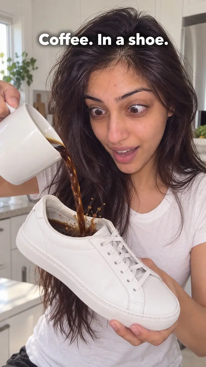
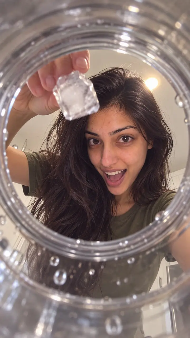
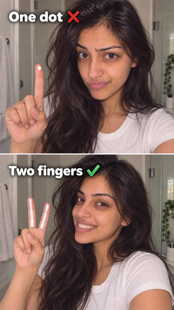
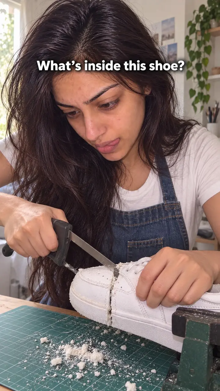
Fake interface hook, in pictures
Why it works
- Familiar screens can attract attention
- Viewers may recognise the shape of a notification or reminder quickly. That familiarity can draw attention, but it does not guarantee that they will stop scrolling. The screen should remain clearly staged rather than appear to report something about their device.
- A relevant preview can create curiosity
- A short message preview or covered image can leave a question the viewer wants answered. This may encourage continued watching when the next shot delivers a clear, relevant reveal; an unrelated tease can instead feel misleading.
- A visible action can connect setup and reveal
- An on-camera tap or swipe can help viewers follow the transition from the staged interface to the footage. It may make the sequence feel connected, but there is no evidence here that it reliably makes the reveal feel earned or improves retention.
The formula
- Pick one familiar screen: content warning, notification, message preview, reminder or battery alert.
- Write one short line that points to the reveal ahead.
- Hold the screen just long enough to read, with a matching sound.
- Tap, swipe or dismiss the screen on camera.
- Cut straight to the shot that answers the line.
On screen: '[Familiar screen type]: [specific problem, question or moment]' + [tap or swipe + matching sound] + Cut to: '[the product, person or result that answers it]'How to use it
- Pick one interface your audience recognises
Choose a screen your viewer already knows. A message preview suits a review or question. A content warning suits a launch or texture reveal. A battery alert suits a power problem. Pick one. Do not stack alerts.
- Write one line that sets up the reveal
Write the alert as a plain, specific line. Name the problem or moment, not a vague tease. For example: 'Your [item] is out of charge again.' Keep it short enough to read at a glance.
- Build the fake screen
Build the frame in your editor with large text, simple icons and high contrast. Leave out real names, real phone details and logos you do not own. Keep it inside the safe zone so TikTok, Reels and Stories buttons do not cover it. Check it on a small screen.
- Add the action and sound
Add a tap, swipe or dismiss gesture. A real hand works well because it makes the action clear. Time the sound to the movement so the screen feels like it responds.
- Cut straight into the real video
Cut, wipe or zoom from the tap into your first real shot. Do not add a logo intro or a pause. The next shot should show the product, person or result the alert pointed to.
- Test it with and without sound
Watch it muted, then with sound. If you cannot read the line in time, cut words. If the reveal feels unrelated, rewrite the alert. Post a version without the fake screen too, and compare how long people stay.
Examples
| Niche | Line | Why it works |
|---|---|---|
| Beauty (product launch) | On screen: 'Sensitive content: [product name] drops [date]' [tap 'See video'] Cut to: the product turning in your hand, then a close-up swatch. | The warning frames the launch as something worth uncovering, and the first real shot is the product itself. |
| Tech accessories | On screen: 'Low battery: [number]% remaining' [swipe away] Cut to: your power bank plugged in, phone charging, mid-commute. | Problem and fix match exactly. The viewer sees the use case with no setup. |
| Skincare | On screen: '1 new message: [customer first name]' [tap] Cut to: their review, shared with permission, then you applying the product. | A real customer's words feel like news, and the demo backs them up right away. |
| Food | On screen: 'Reminder: [ingredient] expires today' [dismiss] Cut to: that ingredient going into the pan with your sauce. | It gives the recipe a reason to exist and shows the product as the answer. |
| Home and storage | On screen: 'Storage almost full' [tap] Cut to: an overflowing cupboard, then the same shelf sorted with your organisers. | A common phone annoyance points straight to a common home annoyance. |
| Fashion | On screen: 'Calendar: [event] in [number] hours' [swipe] Cut to: the first full outfit on, no intro. | The reminder acts as a title card, then the viewer gets the look they came for. |
| Fitness creator | On screen: 'Screen time: [number] hours sitting today' [dismiss] Cut to: the first move of a short desk stretch. | It names a habit viewers recognise, then starts the routine with no warm-up talk. |
| Education or coaching creator | On screen: 'New voicemail: your most asked question' [tap play] Cut to: you answering it to camera in one line. | It promises one specific answer and keeps the video focused on it. |
| Pet creator | On screen: 'Photo hidden: what [pet name] did while I was out' [tap] Cut to: the real clip from the start. | The cover builds curiosity, and the payoff is a genuine moment, not a staged trick. |
Variations
- Content warning reveal
- A blurred or greyed-out frame with a 'sensitive content' style label. A tap clears it into your real shot. Best for launches, textures and before-and-after results where the visual is the payoff.
- Message preview
- A notification banner or inbox preview with one clear question or comment. Tap to open it, then answer on camera or show a demo. Only show a real customer's words with their permission.
- System-style alert
- A low-battery, storage-full or screen-time style alert that names a problem. Swipe it away into the fix. Keep the design clearly staged, not a pixel copy of a real warning.
- Reminder or calendar note
- A reminder that names a time or event, such as '[event] at [time]'. Dismiss it into the scene it points to: a routine, a trip, a try-on or a product in use.
Common mistakes
- Stacking several alerts in the first second
- Fix → Pick the one screen that matches your reveal. Let a single line do the work.
- Using an alert that has nothing to do with the video
- Fix → Rewrite the alert so it names the exact problem, question or moment your next shot answers.
- Making the fake screen look like a real warning about the viewer's phone
- Fix → Do not copy a real system warning or invent a message from a real person. Build a generic, clearly staged screen and move to real footage fast.
- Text that is too small or stays up too briefly
- Fix → Cut words, enlarge the text and test the frame on your phone at arm's length before you post.
- Running fake buttons or system alerts in paid ads without checking policy
- Fix → Check the platform's current ad rules first. If the rule is unclear, keep the format for organic posts.
When not to use it
- When there is little worth revealing, use the Problem recognition hook instead. Name a genuine problem and show how the content addresses it rather than adding a screen that delays the point.
- When a paid placement restricts simulated alerts or nonfunctional controls, or the current policy is unclear, use the Text-first frame hook instead. Plain text avoids this particular interface-imitation issue, though the full ad still needs policy review.
- When the opening could be mistaken for a real emergency, security warning or report about the viewer's device, use the Sound cue hook instead, with a non-alarming sound tied to a visible action. Organic placement does not make a deceptive warning acceptable.
- When viewers need a direct, trustworthy answer about health, money or safety, use the Objection handling hook instead. State the relevant concern and answer it with appropriate evidence rather than placing it behind a simulated alert.
For brands
For DTC brands, this hook works best in organic Reels, TikTok and Stories when the product solves the exact problem on the fake screen. The reveal is your proof moment, so show the product in use in the next shot, not just in its packaging. Keep paid ads for other openings unless the platform clearly allows the format.
- Launch teaser: open on a 'sensitive content' screen labelled '[product name], [launch date]', tap through to the first close-up, and repeat the format in Stories on launch day.
- Power and tech accessories: open on a staged low-battery alert, swipe it away, and show the charger or power bank working in a real setting like a commute or a festival.
- Customer reviews: open on a '1 new message' banner with a real customer's review, shared with permission, then cut to the product doing what they described.
- Restock or back-in-stock posts: open on a notification that reads '[product] is back', tap it, and show the product with one reason people asked for it.
- Problem-led product demos: match a phone-style alert to a home, beauty or fitness problem, such as 'Storage almost full' for organisers, then show the fix in one shot.
Pairs well with
- Hidden reveal
Both hold the payoff back for a beat. Use the fake screen as the cover, then let the hidden product land as the first real shot.
- Sound cue
The notification sound does half the work. Pair the screen with a familiar cue so viewers react before they read every word.
- Customer story
A message-preview screen is a natural way to open on a real customer's words. Tap it open, then tell their story.
- Text-first frame
The alert line is your big first-frame text. Apply the same rules: short, large and readable at a glance.
FAQs
- How do I make a fake interface hook video for free?
- Most free video editors can do it. Add a screen-style frame, text and an icon as separate layers. Animate a tap or swipe, add a sound, then cut to your footage. Free templates exist, but check the licence before you publish.
- Do I need a fake interface hook generator or Python?
- No. A generator can speed up layout, and Python can automate batches of frames, but one video only needs an editor, a clear alert line and a clean cut into your footage.
- Does a fake interface hook work on TikTok and Reels?
- Yes, if the screen is clearly tied to your topic. Keep the frame readable in portrait, keep text large and inside the safe zone, and test it muted and with sound. Stories work too, since the tap-to-continue feel fits the format.
- Can I use a fake interface hook in paid ads?
- Be careful. Many ad platforms restrict creative that imitates system alerts, fake buttons or features the ad does not have. Rules change, so check the current policy before you run it. When in doubt, keep it for organic posts.
- How long should the fake screen stay on screen?
- Keep it brief. Show it long enough for the viewer to read the key line and hear the cue, then move on. If people would need to pause to read it, cut words or enlarge the text.
- Is a fake interface hook misleading?
- It can be. It stays fair when the reveal matches the promise on the screen. Do not invent a message from a real person, fake a warning about the viewer's phone, or hide the real content for long. Make the link clear in the next shot.
Key takeaways
- Use one familiar screen, one short line and one clear tap or swipe.
- The next shot must answer the alert. If it does not, rewrite the alert.
- Keep it honest. Do not fake real messages, real warnings or results you cannot show.
- It is built for organic Reels, TikTok and Stories. Take extra care in paid ads, where imitated system alerts and fake buttons are often restricted.