Comparison Hook: Two Options Side by Side
Also called: Side-by-side comparison, Us vs Them, A/B visual hook, This vs That
A small apparel brand has a basic white T-shirt that costs more than the one in the supermarket. Saying 'it's better quality' gets ignored. So the founder washes both shirts [number] times, lays them flat on the same table and films one shot. The cheap shirt has a twisted seam and a stretched collar. Theirs looks almost new. The caption reads 'Cheap vs ours. Guess which is which.' Nobody needs a sales pitch to get the point.
That is a comparison hook. You put two things side by side and let the viewer judge. It works for brands, and it works for creators comparing two methods, two budgets or two choices. This guide shows you how to set up the shot, what to say, how to fit it to each format and how to keep it fair.
What is a comparison hook?
A comparison hook is a video opening that places two products, prices or options side by side in the first frame. It invites the viewer to judge the difference before you explain it.
You open with both options already in frame. You don't start with one item alone, and you don't start with a long intro. The viewer sees the contrast first, then hears your point. Picture a cheap T-shirt and an expensive one after [number] washes, laid side by side. You can compare price, material, size, ingredients, finish, method or result. You can compare your product with a common alternative, an older version or a homemade option. Creators can compare two ways of doing the same task. Fairness is what makes it work. Both sides get the same light, the same test and the same time on screen. Then you show the difference up close. That proof is the rest of your video.
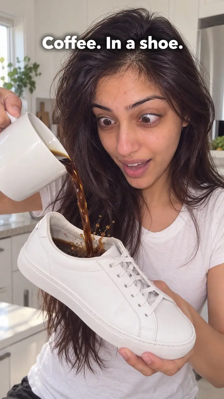
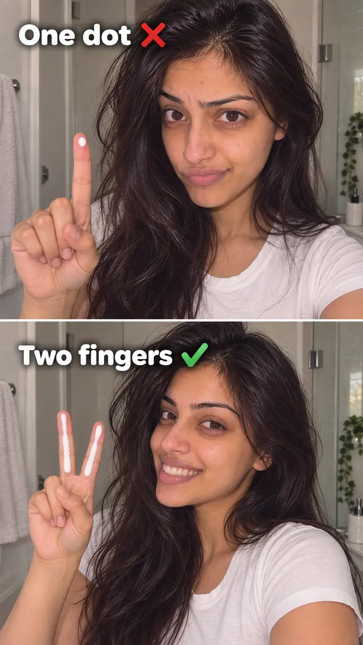
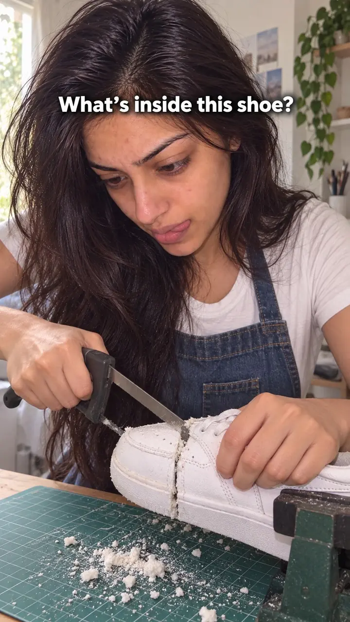
Comparison hook, in pictures
Why it works
- A clear choice can invite participation
- Two recognisable options can give viewers a simple task: compare them and decide which they prefer. This may encourage closer attention when the difference matters to them.
- Shared framing can make differences easier to inspect
- Showing both options together can help viewers compare visible details without relying on memory. The shot still needs accurate labels and relevant context; appearance alone does not establish overall quality.
- A relevant reveal can create curiosity
- Temporarily hiding a price or label can give viewers a reason to watch for the answer. Reveal it clearly and avoid withholding information that would materially change how the comparison is understood.
The formula
- Choose two options your viewer already understands, like cheap vs expensive, store-bought vs homemade or method A vs method B.
- Frame both from the first second, at the same size, distance and light.
- Name the contrast on screen in two to four words.
- Give the viewer a job: guess, judge or pick a side.
- Run one identical test on both, then reveal the result in a close shot.
First frame: [Option A] and [Option B] side by side. On screen: '[Option A] vs [Option B]'. Voice: 'Guess which one [costs more / lasts longer / is mine].' Then: same [test] on both, close-up on [the detail that shows the difference], reveal the labels.How to use it
- Pick one clear contrast
Choose a contrast your viewer cares about. Price, durability, ingredients, method and finish work well. Skip vague pairs like old vs new if the viewer can't see what changed.
- Put both items in frame at once
Place both options next to each other before you speak. Fill the frame. Keep labels, prices or key parts visible. If the viewer needs a lot of context to get it, the pair is too complex.
- Label the difference in short text
Use a few words, like 'Cheap vs expensive' or 'Store-bought vs homemade.' Place the text so it doesn't cover the items. Make it large enough to read on a phone.
- Ask the viewer to judge
Say one short line, like 'Guess which one cost more.' Then pause briefly. That gives the viewer time to pick a side.
- Test both the same way
Wash both. Drop both. Pour both. Use the same action, force and time. If the test isn't fair, viewers will notice and stop trusting you.
- Show the result up close
Move the camera in. Show the seam, the dent, the texture or the label. Say which item is which. End with one plain sentence about what the viewer just saw.
- Fit it to the format
On Reels and TikTok, have both items on screen before your first word. On a carousel, slide one shows the pair and the question, and later slides show the test and the answer. In a static ad, use a clean left-right layout with one label on each side.
Examples
| Niche | Line | Why it works |
|---|---|---|
| Fashion (DTC) | '[Low price] tee vs [higher price] tee after [number] washes. Guess which is which.' | The wash count sets a fair test. The guess keeps the viewer waiting for the collar close-up. |
| Food (DTC) | 'Store-bought granola vs ours. Same bowl. Labels side by side.' | Two ingredient lists give the viewer something concrete to read and compare. |
| Accessories (DTC) | 'Plastic bottle vs steel bottle. Same drop from [height]. Watch the bottom.' | The result shows at once. The viewer stays to see which one failed. |
| Beauty (DTC) | 'Same [amount] of two moisturisers. Left vs right. Which one sinks in?' | Equal amounts keep it fair, and texture shows the difference without words. |
| Home (DTC) | 'Old pan vs new pan. Same egg, same heat. Watch it slide.' | One simple action tests both items. The viewer judges without taking your word for it. |
| Fitness gear (DTC) | 'Two resistance bands after [number] weeks. Spot the one that's going thin.' | Wear and tear is visual. The 'spot it' prompt makes the viewer look closely. |
| Home cook creator | '[Price] dinner vs [price] dinner for [number] people. Which plate would you pick?' | Price sets up the question. The plates let the viewer vote before the reveal. |
| Fitness coach | 'Resting [number] seconds vs [number] seconds. Same set. Watch the last rep.' | The coach teaches by showing one change. Viewers see the difference instead of hearing a rule. |
| Travel creator | 'Rolling vs folding. Same carry-on, same clothes. Which fits more?' | A shared bag makes it fair. The packed bags give a clear answer at the end. |
| Photography creator | 'Phone vs [price] camera. Same window light. Guess which is which.' | The blind guess challenges what viewers assume about cost, so they wait for the answer. |
Variations
- Price reveal
- Show two versions of the same item at different prices with the tags hidden. Let the viewer guess. Then reveal the prices and point to the one detail that explains the gap.
- Blind pick
- Cover names, logos or labels. Run the test and ask viewers to pick the winner in the comments before you uncover them. Use it when the result may surprise people.
- Method vs method
- Compare two ways of doing the same task, not two products. Two packing styles, two recipes, two edits. This is the natural version for creators who don't sell anything.
- Then vs now
- Put an old version next to the current one. That could be your first batch and your latest, or last year's design and this year's. Show one change at a time so the viewer can follow it.
Common mistakes
- You show one item first and add the second one later.
- Fix → Start with both items already side by side. Save your intro until the viewer knows what to judge.
- You compare too many things at once.
- Fix → Pick one contrast for the opening, like price. Move the other points to later in the video or the caption.
- You make one side look worse with lighting or editing.
- Fix → Use the same light, distance and test for both. Film them together when you can, so viewers can check the setup.
- Your text is too small or too long to read.
- Fix → Use short text that names the pair, like 'Plastic vs steel.' Keep it big and away from the items.
- You name the winner but never show the difference.
- Fix → Zoom in on the seam, surface, dent or ingredient list. Let viewers see the proof before you give your verdict.
- You name a competitor in a way that isn't accurate.
- Fix → Compare types, not names, unless you can prove the claim. Check prices, labels and test conditions before you post.
When not to use it
- If the useful result only becomes clear through extended use, consider Real-world test (real-world-test-hook). Report what actually happened over [duration], including relevant conditions and limits, rather than forcing the result into an immediate comparison.
- If the value is mainly a service experience that cannot be judged visually, consider Customer story (customer-story-hook). Use a real customer's account with permission and avoid presenting one person's experience as a typical or guaranteed outcome.
- If you cannot obtain a relevant alternative or support a fair comparison, consider Behind the scenes (behind-the-scenes-hook). Show your actual process without implying unverified superiority; changing hooks does not remove the need to support factual claims.
- If the point is how to correct a specific mistake rather than choose between options, consider Corrective (wrong vs right) (corrective-hook). Explain when the recommended method applies instead of presenting a context-dependent choice as universally wrong.
For brands
For DTC brands, this hook earns its place when your advantage shows on camera: a lower price, better build or a visible difference. If you can only explain your edge in words, pick another hook. Here are practical ways to use it.
- Film against what your buyer already owns. Put your product next to the common alternative, like a supermarket tee or a plastic bottle. Run one test and close on the result.
- Pair price with proof. Show '[your price]' next to '[alternative price]', then show what the money buys: stitching, weight, ingredients or finish. A price gap with no visible reason invites doubt.
- Use the label as the test. For food, beauty and supplements, place both ingredient lists side by side and read only the lines that differ. Keep the text readable on a phone.
- Run it as a static ad. Use a clean left-right layout with one short label per side and your product on the right. Test two versions: one that shows the price and one that shows only the result.
- Answer the size or fit question. For fashion, bags and home goods, compare two of your own sizes next to an everyday object so buyers pick right the first time.
Pairs well with
- Split screen
Use a split screen when both items need to move or change at the same time, like two fabrics soaking in water. The comparison sets up the choice, and the split view shows it play out live.
- Side-by-side test
Open with the comparison to win the first second, then run a full side-by-side test to win trust. The hook asks the question and the test answers it.
- Curiosity gap
Hide the labels or prices at the start. The viewer knows the two items differ but not how. That gap keeps them watching until the reveal.
- Community debate
End by asking viewers which side they would pick and why. A comparison gives them a ready-made choice to argue about in the comments.
FAQs
- What is a video hook in Instagram?
- A video hook on Instagram is the first thing a viewer sees and hears in your Reel. It gives them a reason to stop and watch. With a comparison hook, that reason is visual. Two items sit side by side, and the viewer wants to know which one is better and why.
- Can you give me an example of a hook?
- Yes. Put two T-shirts in frame after the same number of washes. Add the text: '[Low price] vs [higher price] after [number] washes. Guess which is which.' Then zoom in on the fabric and reveal the answer. The viewer gets a clear choice, a small test and a reason to stay.
- What is an example of a strong hook?
- A strong hook makes its point without sound or context. For example, you hold a plastic bottle in one hand and a steel bottle in the other after the same drop. One is cracked. One isn't. The viewer sees the point before you say a word.
- What is a catchy hook?
- A catchy hook is easy to grasp and hard to ignore. It isn't just loud or fast. It gives the viewer a task, a question or a contrast. 'Cheap vs expensive' works because people start picking a side straight away, before they know the details.
- How is a comparison hook different from a side-by-side test?
- The comparison hook is the opening frame. It gets attention. The side-by-side test is the proof that follows. You might open on two granolas side by side, then pour both into milk. The hook earns the watch. The test earns the trust.
- Can you name a competitor in a comparison hook?
- You can, but it must be fair and accurate. Use the real product under the same conditions. Don't hide labels to mislead, and don't edit one side to look worse. Check your claim twice. If you can't prove it on camera, compare types instead, like plastic vs steel.
Key takeaways
- Put both options in the first frame. Don't build up to the comparison.
- Give the viewer a job: guess, judge or pick a side.
- Keep the test fair and identical for both sides.
- Show the difference up close before you explain it.
- If your edge doesn't show on camera, pick a different hook.